Want to make sense of complex financial data quickly? Financial data visualization transforms raw numbers into clear visuals, helping you identify trends, assess risks, and optimize investment strategies. Here's what you'll learn:
- How tools like TradingView, Koyfin, and Finviz simplify market analysis
- Key visualization methods: candlestick charts, heatmaps, and scatter plots
- The best Python libraries (like Matplotlib and Plotly) for custom visuals
- Design tips for creating clear, actionable charts
Quick takeaway: Visualizing financial data isn't just about making charts - it’s about turning complex datasets into insights you can act on, whether you're analyzing trends, managing risk, or fine-tuning a portfolio.
Financial Data Visualization In Pyplot | Python Tutorial
Core Visualization Methods for Quant Analysis
In quantitative research, turning raw financial data into actionable insights often hinges on effective visualization methods. These tools help uncover market trends, evaluate risk, and analyze statistical patterns.
Time Series Charts and Graphs
Time series visualizations are essential for tracking price movements over time. Platforms like TradingView provide a range of tools to make sense of these trends:
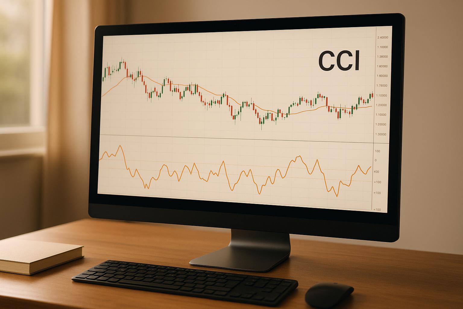
- Candlestick Charts: Capture opening, closing, high, and low prices for each time interval.
- Line Charts: Highlight continuous price trends and key movement patterns.
- Volume Bars: Display trading volume directly below price charts.
- Moving Averages: Add trend indicators based on different time periods.
For example, Stock Rover users frequently overlay 50-day and 200-day moving averages on candlestick charts to pinpoint support and resistance levels. These charts not only reveal trends but also provide insight into market momentum.
Risk and Portfolio Charts
Visualizing risk and portfolio composition is another critical aspect of quant analysis. Tools like Koyfin make it easier to understand exposure and allocation through various chart types:
| Chart Type | Primary Use | Key Insights |
|---|---|---|
| Heatmaps | Sector Performance | Highlights relative strength or weakness across sectors. |
| Treemaps | Portfolio Allocation | Illustrates asset weightings and hierarchical structure. |
| Risk Scatter Plots | Risk/Return Analysis | Maps assets based on their volatility and performance. |
These visualizations offer a clear snapshot of portfolio health and help investors fine-tune their strategies.
Statistical Charts and Plots
When it comes to uncovering deeper patterns in data, statistical charts are invaluable. Platforms like Finviz provide tools that go beyond standard trend analysis:
- Histograms: Reveal the distribution of returns and volatility.
- Box Plots: Highlight outliers and the range of values within a dataset.
- Correlation Matrices: Show relationships between different assets or factors.
Top Data Visualization Tools
Data visualization tools play a crucial role in quantitative research, offering tailored solutions to transform raw data into meaningful insights.
Market Analysis Software
When it comes to analyzing market trends and patterns, these platforms stand out for their advanced visualization capabilities:
| Platform | Key Features | Ideal For |
|---|---|---|
| TradingView | Community scripts, global data | Technical analysis, pattern recognition |
| Koyfin | Custom dashboards, multi-asset analytics | Portfolio visualization, market research |
| Finviz | Heat maps, technical screeners | Market screening, correlation analysis |
| Trade Ideas | AI signals, automated backtesting | Trading analytics |
TradingView offers a user-friendly interface with access to global data and community-created scripts, making it a go-to for technical analysis. Koyfin, on the other hand, provides professional-grade dashboards that allow users to track multiple data points across various assets. Finviz excels in market screening with its heat maps and correlation tools, while Trade Ideas leverages AI for advanced trading insights and automated backtesting.
For those seeking even more customization, Python offers powerful libraries to create personalized visualizations.
Python Tools for Visualization
Python is a favorite among researchers and analysts for its ability to produce flexible, high-quality visualizations. Some of the most popular libraries include:
- Matplotlib: Perfect for creating static, publication-ready plots.
- Plotly: Ideal for interactive, web-based visualizations that engage users.
- Seaborn: Known for its polished, aesthetically pleasing statistical graphics.
These libraries allow users to design visuals that go beyond the constraints of standard platforms, making them especially valuable for custom research projects.
Professional Market Data Platforms
For institutional-level analytics, professional platforms offer unparalleled data integration and advanced visualization tools.
SpotGamma is a standout option, delivering proprietary options flow data, volatility dashboards, and insights into institutional options activity and dark pools. Platforms like Market Chameleon and FinBox provide additional features such as:
- Real-time market data visualization
- AI-driven earnings analysis
- Sentiment tracking tools
- Custom API integration for tailored solutions
If you're looking for more in-depth reviews and comparisons, check out the Best Investing Tools Directory (bestinvestingtools.com) for expert insights into these platforms.
sbb-itb-2e26d5a
Data Visualization Standards
Creating effective financial visualizations requires adhering to specific design principles and maintaining high-quality standards.
Chart Design Principles
The key to impactful financial visualizations lies in choosing the right chart types and design elements that make complex data easier to understand. Here’s how to approach chart design for financial data:
Color Selection
- Stick to a consistent color palette throughout.
- Use contrasting colors to differentiate data series.
- Reserve red and green exclusively to indicate losses and gains.
- Opt for colorblind-friendly schemes to ensure accessibility.
Layout Guidelines
- Place the most critical information in the top-left corner for maximum visibility.
- Use a 16:9 aspect ratio to make charts presentation-ready.
- Include clear and concise titles that explain the chart’s purpose.
- Add simple legends that don’t clutter or obscure the data.
| Chart Type | Best Use Case | Key Design Considerations |
|---|---|---|
| Candlestick | Price action analysis | Use consistent color coding for up/down movements. |
| Line Charts | Trend analysis | Ensure appropriate line thickness and style. |
| Heat Maps | Correlation studies | Use clear and logical color gradient scales. |
| Bar Charts | Volume analysis | Maintain proper spacing between bars. |
This structured approach ensures that your charts not only look professional but also communicate data with clarity.
Data Quality Guidelines
High-quality visualizations rely on accurate and reliable data. Without this foundation, even the best-designed charts can mislead.
Data Validation
- Confirm data sources, timestamps, and time zones to avoid discrepancies.
- Check for completeness and ensure outliers are accurate and not errors.
- Double-check calculations and any data transformations for accuracy.
Update Frequency
- Real-time data: Ensure continuous updates for live tracking.
- Daily metrics: Refresh data after market close for consistency.
- Historical analysis: Clearly document the data’s vintage.
- Backtesting results: Always include the test period for context.
Presentation Methods
Once you’ve nailed the design and data quality, the way you present your visualizations can significantly impact how well your insights are understood.
For Institutional Investors
- Highlight advanced metrics that resonate with their expertise.
- Include statistical significance levels to validate findings.
- Offer drill-down features for deeper analysis.
- Emphasize key risk indicators to support decision-making.
For Research Reports
- Use a consistent formatting style to maintain professionalism.
- Add detailed annotations to clarify complex points.
- Provide proper source citations for credibility.
- Include technical appendices for those who want to dive deeper.
To present complex financial data effectively:
- Begin with an overview chart to set the stage.
- Gradually move into detailed analysis to build understanding.
- Wrap up with actionable insights that guide decision-making.
- Incorporate relevant benchmarks for context.
For interactive presentations, consider platforms that support real-time updates and dynamic filtering. This gives your audience the flexibility to explore the data while preserving the integrity of your analysis.
New Developments in Financial Visualization
Live Market Visualization
Keeping up with the markets in real time has never been more important for quantitative research. Today’s platforms combine live data feeds with dynamic dashboards, offering an up-to-the-minute view of market activity. Tools like multi-asset correlation displays and automated smart alerts make it easier to spot emerging opportunities and act quickly. If you're looking for detailed reviews of advanced visualization tools, check out the Best Investing Tools Directory at https://bestinvestingtools.com.
Machine Learning in Visualization
Real-time updates are just the beginning. Machine learning is taking financial visualization to the next level by uncovering patterns, flagging anomalies, and delivering predictive insights. These algorithms simplify complex datasets, turning them into visuals that are easier to interpret and act upon. The result? Clearer insights and more confident decision-making in an increasingly data-driven world.
Advanced Display Technologies
Financial data analysis is also getting a boost from cutting-edge display technologies like augmented reality (AR) and 3D visualization. AR can overlay digital data onto real-world environments, making insights more accessible and intuitive. Meanwhile, 3D visualization opens up new ways to explore multi-dimensional datasets, offering a richer understanding of market trends and portfolio performance. As these technologies evolve, they’re set to redefine how we interact with financial information, making analysis more engaging and insightful than ever before.
Summary
Main Points
Visualizing financial data has reshaped how we understand and act on market information. By pairing advanced visualization tools with real-time data feeds, market analysis has become more intuitive, helping users spot trends and make decisions faster.
Here are some standout benefits of financial data visualization:
- Simplified Data: Turns raw numbers into easy-to-understand visuals.
- Trend Detection: AI and machine learning help uncover market patterns and anomalies.
- Instant Insights: Real-time dashboards and alerts provide up-to-the-minute analysis.
These tools not only improve communication and decision-making but also enhance the ability to recognize patterns, laying the groundwork for more streamlined quantitative research.
Additional Resources
Looking to expand your financial visualization tools? Check out the Best Investing Tools Directory. This resource highlights platforms offering features like:
- Advanced charting with Level 2 data access
- AI-powered analytics for earnings call interpretation
- Technical analysis tools with pattern recognition
- Customizable stock and commodity screeners
- Options flow visualization to analyze market volatility
Many of these platforms also provide educational content to help you get the most out of their features. By blending traditional financial analysis with cutting-edge visualization tech, investors can build a strong framework for smarter decisions. And with the rise of AR and 3D visualization, the future holds even more intuitive tools for understanding market dynamics.
FAQs
How can tools like TradingView and Koyfin enhance investment strategies through financial data visualization?
Financial data visualization tools like TradingView and Koyfin can help simplify the complexities of investment analysis. These platforms transform dense financial data into interactive charts and dashboards, making it easier to spot trends, compare metrics, and uncover patterns.
Take TradingView as an example. It provides real-time market data and customizable charts, allowing you to monitor price movements and technical indicators with ease. On the other hand, Koyfin focuses on advanced financial analytics and macroeconomic data, equipping investors with deeper insights for smarter decision-making.
By using tools like these, you can fine-tune your strategies, identify potential opportunities, and better navigate risks in the ever-changing financial landscape.
What are the benefits of using Python libraries like Matplotlib and Plotly for financial data visualization?
Python libraries like Matplotlib and Plotly provide excellent tools for crafting financial visualizations that align with your research needs. These libraries help you handle large datasets, create detailed charts, and adjust visual elements to emphasize critical insights.
Matplotlib is a go-to choice for producing static, high-quality visualizations suitable for publications or reports. Its ability to create clean and professional charts makes it perfect for presenting straightforward financial data. Meanwhile, Plotly shines when it comes to interactive visualizations. With Plotly, you can build dynamic graphs that allow users to explore data, making it especially handy for showcasing trends or analyzing complex financial patterns.
Using these tools, you can not only deepen your understanding of financial data but also present your findings in a visually engaging way, adding value to your quantitative research.
How does machine learning improve financial data visualization to identify market trends?
Machine learning brings a new level of clarity to financial data visualization by spotting complex market patterns that might otherwise go unnoticed. It sifts through massive datasets, identifies correlations, and reveals trends that can shape quantitative research and guide investment strategies.
When paired with advanced charting tools, machine learning enables analysts to visualize predictive insights, automate data analysis, and make smarter decisions. If you're looking for tools that offer these capabilities, consider exploring directories that list investment research and visualization platforms specifically designed for investors.