3D dashboards are changing how financial data is analyzed by adding depth, interactivity, and real-time insights. They solve the limitations of traditional 2D dashboards, making it easier to uncover patterns, trends, and relationships in large datasets. Here’s what you need to know:
-
Key Features to Look For:
- Interactive Displays: Rotate, zoom, and filter data for better analysis.
- Customization: Tailor dashboards to focus on specific metrics or roles.
- Live Data Feeds: Access real-time updates and automated reports.
- System Integration: Seamlessly connect with portfolio and trading systems.
- Mobile Access: Use dashboards on the go without losing functionality.
-
Benefits:
- Improved decision-making through interactive visuals.
- Handles large datasets without clutter.
- Enhances user engagement and collaboration.
-
Drawbacks:
- Requires advanced hardware and training.
- Higher costs compared to 2D dashboards.
Quick Comparison: 3D vs. 2D Dashboards
| Aspect | 3D Dashboards | 2D Dashboards |
|---|---|---|
| Data Exploration | Interactive (rotate, zoom, filter) | Static with basic zoom/scroll |
| Pattern Recognition | Reveals hidden trends and relationships | Limited to flat visuals |
| User Engagement | More immersive and effective | Basic and less engaging |
| Learning Curve | Requires training | Easy to use |
| Hardware Needs | High-performance GPUs | Standard computer setups |
| Data Complexity | Handles large datasets with clarity | Can become cluttered |
3D dashboards are ideal for professionals needing deeper insights and better visualization. However, they require investment in hardware, training, and integration to fully unlock their potential.
Financial Data Visualization in 3D on Immersive Virtual Reality Displays
Must-Have Features in 3D Dashboards
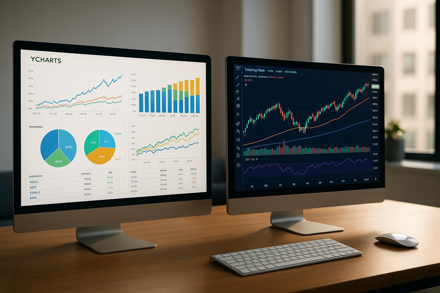
Modern 3D dashboards address the limitations of traditional 2D formats by offering interactive tools, flexible customization, and real-time data capabilities. These features enhance decision-making by delivering deeper insights. In fact, interactive 3D dashboards have been shown to improve timely insight discovery by 28%. Let’s break down the key elements that make these dashboards indispensable, starting with interactivity.
Interactive 3D Data Display
Interactive 3D displays revolutionize how market data is explored. Unlike static charts, these tools let you rotate, zoom, and manipulate visualizations to uncover patterns and relationships that would otherwise remain hidden in 2D formats. For instance, portfolio correlations can be analyzed from multiple angles, exposing connections between asset classes that flat charts might obscure. Features like time, region, or asset-type filters, along with hover tooltips and drill-down capabilities, make the experience even more intuitive. Color-coded visuals further streamline analysis - for example, using pink for churn, yellow for contraction, purple for expansion, and green for new accounts in customer retention analysis. This dynamic approach not only simplifies complex data but also enhances the precision of your insights.
Dashboard Customization Options
Customization is key to making a 3D dashboard truly effective. The best platforms allow you to tailor dashboards to specific roles, ensuring that executives can focus on high-level KPIs while portfolio managers dive into detailed metrics and risk assessments. These dashboards also support the integration of various data sources - combining market data, fundamental analysis, and proprietary research into seamless visualizations. AI-driven customization takes it a step further by learning your preferences and automatically adjusting layouts or highlighting relevant information. For example, pre-designed templates can simplify the display of key metrics by incorporating text and image elements into the dashboard. This level of personalization ensures that every user gets exactly what they need to make informed decisions.
Live Data Feeds and Automated Reports
Real-time data is a game-changer for professional 3D dashboards, setting them apart from basic tools. Live feeds eliminate delays, keeping your data accurate and up-to-date, while automated reports provide timely updates and alerts for critical changes. These alert systems free you from constant monitoring, allowing you to focus on analysis instead. Look for platforms that offer at least 98% data accuracy and include strong security measures like encryption and controlled access. With McKinsey estimating that businesses will automate a quarter of their processes within the next five years, investing in scalable solutions with real-time reconciliation capabilities is essential. Such tools ensure data integrity and support smarter, faster investment decisions.
Benefits and Drawbacks of 3D Dashboards
Expanding on the challenges of traditional 2D dashboards, let’s dive into the advantages and limitations of advanced 3D interfaces. While 3D dashboards bring exciting opportunities for market analysis, they also come with their own set of challenges that investors need to carefully consider to align with their goals and resources.
3D vs 2D Dashboard Comparison
The distinction between 3D and 2D dashboards goes far beyond their visual appeal. Studies indicate that 3D data visualization can improve data comprehension by adding depth, which helps users better understand spatial relationships and creates a more immersive experience. Interestingly, companies that leverage data effectively report 4% higher productivity and 6% higher profits.
"Visuals are the best tools we have for understanding and communicating large-scale phenomena." – Parker Ziegler, Computer Science PhD Candidate, University of California, Berkeley
Here’s how 3D dashboards compare to their 2D counterparts:
| Aspect | 3D Dashboards | 2D Dashboards |
|---|---|---|
| Data Exploration | Interactive features like rotation, zooming, and navigation in 3D space | Limited to flat views with basic zoom and scroll functions |
| Pattern Recognition | Highlights trends and correlations often missed in flat visuals | Relies on standard charts and graphs with limited depth |
| User Engagement | More engaging and memorable, improving information retention | Basic visuals that may lead to user fatigue over time |
| Learning Curve | Requires training to master 3D controls | Easy to use with minimal learning required |
| System Requirements | Needs high-performance GPUs and advanced hardware | Compatible with standard computer setups |
| Data Complexity | Handles large datasets by separating data layers clearly | Can become cluttered with complex datasets |
This comparison highlights the immersive and cognitive benefits of 3D dashboards, while also acknowledging the technical and usability challenges.
The cognitive benefits of 3D visualization stand out significantly. Visual representations of risk data require less mental effort than textual formats, and visuals inherently provide richer, more intuitive information than words or symbols. This can lead to quicker decision-making and a clearer understanding of complex market dynamics.
However, adopting 3D dashboards isn’t without its hurdles. They require specialized software, high-performance GPUs, and thorough training to help users navigate the 3D environment effectively while avoiding confusion or information overload.
Another key strength of 3D dashboards is their ability to handle multivariate analysis, offering a comprehensive view by displaying multiple variables simultaneously.
For institutional investors, the advantages often outweigh the costs. Real-time data interaction allows analysts to spot trends, simulate potential scenarios, and predict outcomes with greater ease. Additionally, 3D dashboards enhance collaboration by providing clearer insights that teams can communicate and act on more effectively.
Next, we’ll explore how these dashboards integrate seamlessly with existing portfolio and trading systems.
System Integration and Compatibility
The effectiveness of advanced 3D visualization dashboards lies in their ability to integrate seamlessly with existing systems. When done right, this integration not only streamlines operations but also maximizes the value these dashboards deliver.
Connecting with Portfolio and Trading Systems
In modern portfolio management, smooth data flow between various systems is crucial. To achieve this, 3D dashboards need to connect directly with an organization’s ecosystem. The best solutions integrate with core banking systems, loan origination systems (LOS), CRM platforms, and marketing tools to provide a comprehensive operational view.
For example, in 2022, JP Morgan Chase successfully integrated data from over 15 systems. This move reduced decision-making time by 40% while centralizing real-time portfolio data and risk metrics.
When selecting a platform, look for those that come with built-in automation and integration capabilities. Many modern portfolio management tools incorporate AI and robotic process automation (RPA) to simplify workflows and allow teams to focus on higher-value tasks. Solutions with native automation features are often more efficient than those relying on third-party add-ons.
Data security is another critical consideration during integration. Measures like encrypted data connections and role-based access control help safeguard sensitive information when connecting multiple data sources.
Strong integrations also pave the way for accessible and adaptable mobile and web solutions.
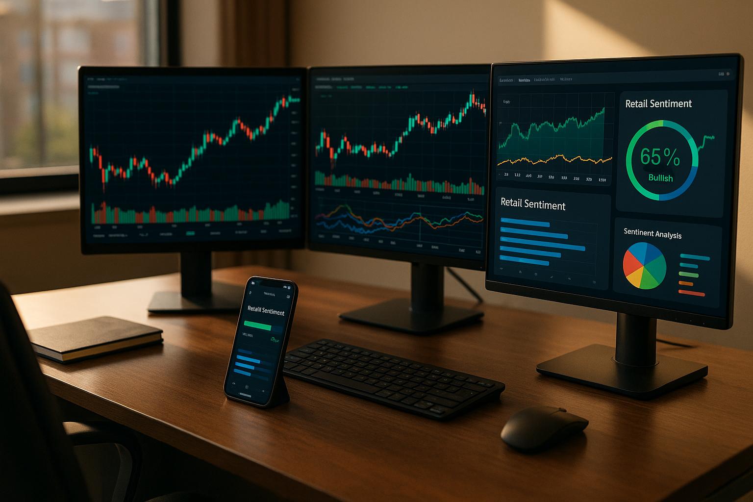
Mobile and Web Access
Investment professionals need uninterrupted access to data, whether they’re in the office or on the go. For 3D dashboards to remain effective across devices, they must maintain their interactive features and visual clarity.
Adapting 3D visualizations for smaller screens can be tricky. Successful platforms use responsive design principles to adjust layouts based on screen size and device capabilities. This ensures that users can interact with 3D models - rotating them, zooming in on data points, and navigating complex layers - on both desktops and mobile devices.
Cloud-based platforms further enhance cross-device compatibility by providing automatic updates and real-time collaboration. These features let team members share insights and annotations, no matter where they are or what device they’re using.
Handling Large-Scale Institutional Needs
Institutional investors often manage enormous datasets that can overwhelm standard tools. To meet these demands, 3D dashboards for enterprise use must handle large-scale data without sacrificing performance or accuracy.
Research shows that organizations using real-time data visualization are five times more likely to make timely, impactful decisions. This advantage depends on the system's ability to process vast amounts of data efficiently.
To optimize performance, advanced 3D systems use techniques like occlusion culling and batch rendering. These methods reduce hardware strain, with one study reporting a 93.7% drop in memory usage and a 60.6% increase in visualization speed compared to traditional approaches.
Enterprise-grade dashboards also require robust server infrastructure and efficient caching to support multiple users without performance dips.
The data visualization market is expected to grow to $19.2 billion by 2027. Additionally, IDC predicts that by the same year, 60% of new physical assets and processes will be modeled as digital twins. This trend underscores the inadequacy of traditional 2D methods in handling the complexity of modern institutional data.
For large-scale deployments, platforms with modular, cloud-based architectures are a smart choice. These systems allow organizations to scale incrementally while staying flexible enough to adapt to changing requirements.
sbb-itb-2e26d5a
Using Directories to Find 3D Dashboard Solutions
Finding the right 3D dashboard solution can be a daunting task. Thankfully, directories simplify this process by organizing key features and user experiences in one place. Consider this: 88% of people interact with businesses they search for on mobile within 24 hours, and 20% of clientele and 30% of revenue come from online directories. That’s where resources like the Best Investing Tools Directory come into play.
How Best Investing Tools Directory Makes a Difference
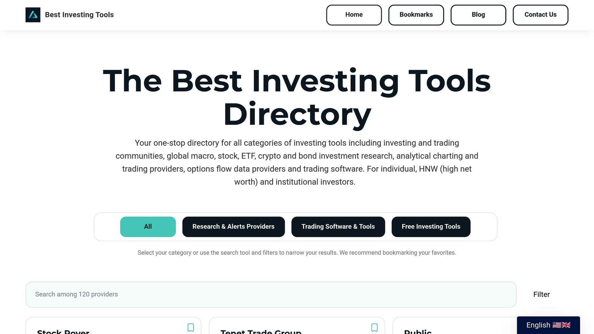
The Best Investing Tools Directory is a valuable resource for investors looking for advanced visualization tools. It simplifies the search for solutions that address analytical challenges by providing detailed information about various 3D dashboard options. With everything from features to pricing and user feedback in one place, it’s easier to compare and make informed decisions.
The directory is accessible 24/7, allowing you to research solutions at your convenience, whether it’s during regular business hours or late at night. Its advanced search capabilities and metadata features make it easy to pinpoint specific dashboard types or features without wasting time.
What sets this directory apart is its focus on user feedback and detailed reviews. Instead of relying solely on vendor descriptions, you get authentic insights into real-world performance and customer support. This kind of transparency is crucial when choosing the right tool for your needs.
Additionally, the directory offers filtering options based on budget and integration capabilities. This targeted approach saves time compared to manually researching individual vendors, helping you focus on solutions that meet your specific criteria.
Steps to Compare and Choose a Dashboard
Once you have a list of potential solutions, a systematic approach can help you determine the best fit. Using the Best Investing Tools Directory, you can evaluate options by focusing on several key factors:
- Define your requirements: Start by identifying your portfolio's scale, budget, and integration needs. This step ensures you focus only on solutions that fit your operational needs.
- Assess performance: Look at data speed, responsiveness, and reliability. User reviews often highlight how well a solution handles large datasets or complex visualizations.
- Check for seamless integration and usability: Make sure the solution integrates with your existing financial systems to avoid inefficiencies or data silos. Intuitive usability and strong customer support are also critical for long-term success.
- Analyze user reviews: Pay attention to feedback from organizations similar to yours. Look for recurring themes about customer support, software updates, or hidden costs.
- Consider long-term value: Don’t just focus on upfront costs. Evaluate potential savings from improved efficiency and scalability. Many platforms offer free trials (typically 7 to 30 days), giving you a chance to test their functionality before committing.
- Prioritize customization and scalability: Choose solutions with extensive customization options to tailor dashboards to your needs. Ensure the software can scale with your organization as it grows.
Avoid options that lack scalability, have overly complex interfaces, or impose hidden costs. The directory’s comparison tools make it easier to evaluate these factors systematically, helping you focus on solutions that align with your goals rather than being swayed by big-name brands.
Conclusion: 3D Dashboards Transform Market Analysis
The move from traditional 2D reporting to dynamic 3D dashboards is reshaping how market analysis is conducted. These dashboards, with their intuitive and customizable interfaces, are helping organizations cut inefficiencies by as much as 35%. Globally, over 42% of companies are already using advanced dashboard technologies to improve the quality of their products and services, highlighting the growing adoption of these tools. This shift not only enhances data analysis but also simplifies decision-making for users across various roles.
By centralizing data, 3D dashboards help break down silos, allowing teams to share insights in real time and focus on metrics that align with their specific responsibilities. Unlike generic reporting tools, these dashboards can be tailored to prioritize the metrics that matter most to individual users.
The benefits are clear: real-time dashboards can accelerate decision-making by 20–25% and improve operational efficiency by up to 15%. Furthermore, studies show that a 15% boost in operational metrics can lead to an average 23% increase in sales. These results are echoed by industry leaders who have embraced the technology.
Stefano Zoni, Chief Data & Analytics Officer at Credem Banca, shares his perspective:
"The dashboard allowed us to organize all of Credem's information assets, making them easily accessible and explorable for all of our employees. Now we can access information much more quickly and easily, which has improved the group's decision-making process."
The growing demand for these tools is reflected in market forecasts. Collaborative dashboard software is expected to grow from $6 billion in 2024 to $6.88 billion in 2025. This surge underscores the recognition that effective dashboards lead to better market responsiveness, tighter cost management, and a stronger ability to anticipate trends.
Key Points to Remember
To make the most of 3D dashboards, keep these essential features in mind:
- Focus on usability, scalability, and actionable KPIs.
- Align KPIs with core business objectives.
- Look for advanced trend analysis capabilities.
- Choose dashboards with robust customization and intuitive visuals.
- Avoid clutter - 67% of executives report "data fatigue" from irrelevant metrics.
- Involve employees in development to achieve up to 30% higher performance improvements.
- Ensure mobile optimization for on-the-go access.
- Maintain data accuracy and consistent updates.
- Pilot solutions with your own data and invest in proper training.
FAQs
What hardware and training do I need to use 3D dashboards effectively?
To make the most of 3D dashboards, you’ll need a computer that can handle the demands of 3D rendering. This means a powerful GPU, at least 8 GB of RAM (though 16 GB or more is recommended for more intensive tasks), and enough storage space for the software. Typically, most tools require at least 600 MB of free disk space, but this can vary depending on the software’s complexity.
Equipping yourself with the right skills is just as crucial. Start by mastering the basics of 3D visualization, data interaction, and customization techniques. Many software providers offer tutorials or tailored courses to help users learn how to interpret and adjust dashboards effectively, especially for market analysis. With proper training, you’ll be able to unlock the full potential of these tools and gain more actionable insights.
How do 3D dashboards improve decision-making compared to traditional 2D dashboards?
How 3D Dashboards Enhance Decision-Making
3D dashboards bring a dynamic, interactive edge to data analysis, offering a fresh perspective compared to traditional 2D dashboards. They let users dive into multiple layers of data, making it easier to spot patterns and connections that might go unnoticed with flat visualizations. This added dimension helps clarify complex relationships, leading to clearer insights.
By transforming intricate datasets into easy-to-navigate 3D models, these dashboards streamline collaboration and accelerate decision-making. Teams can quickly interpret data, recognize trends, and make well-informed decisions, all of which contribute to more effective strategic planning.
What factors should I consider when integrating customizable 3D dashboards with my portfolio and trading systems?
When adding customizable 3D dashboards to your portfolio and trading systems, it’s crucial to ensure they work smoothly with your existing data sources and APIs. This integration enables real-time updates, so your dashboards always reflect the most accurate and current insights.
A clear and intuitive interface is key. Avoid overloading users with too much information - focus on presenting data in a way that’s easy to understand. A well-thought-out dashboard design helps you spot market trends faster and make smarter decisions.
Lastly, make sure your systems align with your workflows and maintain consistent data across all platforms. This approach boosts efficiency and ensures your portfolio and trading management processes remain dependable.