When analyzing investment data, you’ll encounter two main visualization tools: static charts and interactive charting platforms. Here’s a quick breakdown:
- Static Charts: Simple, fixed visuals that provide a snapshot of data. Great for clear, quick overviews but lack interactivity and real-time updates.
- Interactive Platforms: Dynamic tools allowing you to explore, filter, and analyze data in real-time. Ideal for deeper insights but can be overwhelming for beginners.
Quick Comparison:
| Feature | Static Charts | Interactive Platforms |
|---|---|---|
| Real-time Updates | No | Yes |
| Ease of Use | Beginner-friendly | Higher learning curve |
| Interactivity | Fixed, read-only | Fully interactive |
| Cost | Often free or low-cost | Free basic plans, paid advanced features |
| Best For | Quick, clear insights | Detailed, real-time analysis |
Key Takeaway:
- Use static charts for simplicity and quick communication.
- Choose interactive platforms for in-depth, real-time exploration.
Start with static charts if you're new, then transition to interactive tools as your skills grow.
Static Charts: Simple but Limited
What Are Static Charts
Static charts are fixed visual snapshots of investment data that remain unchanged after they’re created. Unlike interactive tools, they don’t allow for zooming, filtering, or exploring additional details.
Ivan Kilin, a Data Visualization Specialist at Datylon, puts it simply:
"By static chart we mean a chart that can't be changed by the user, it's presented as it is, and it's not changed over time."
These charts are commonly found in research reports, investment newsletters, or presentation slides. They might display things like stock price trends over a specific time frame, portfolio allocations, or sector performance comparisons. The defining feature? They’re strictly read-only - you can view the data, but you can’t interact with it to uncover different perspectives.
Benefits of Static Charts
Static charts bring several advantages, especially for those who prefer clear, no-frills representations of data.
One of their biggest strengths is shareability. Since they’re typically images, static charts are easy to distribute via email, social media, print, or slides. This makes them a convenient way to communicate investment insights to a broad audience.
They also excel at focused storytelling. Because the creator controls the narrative, static charts can highlight the most critical data points without overwhelming the viewer. For example, when analyzing quarterly earnings or comparing fund performance, static visuals help keep the message clear and to the point.
Another perk is their efficiency. Static charts are quicker and less costly to produce than interactive ones. A financial advisor, for instance, can easily generate a straightforward portfolio performance chart without needing advanced tools or extra time.
Finally, their simplicity makes them more accessible. Investors with limited technical skills or those relying on assistive technologies like screen readers can easily interpret the data without additional barriers.
Drawbacks of Static Charts
While useful, static charts come with notable limitations - particularly when deeper analysis or up-to-date data is required.
One of the main challenges is their inability to provide real-time updates. If you’re tracking a volatile market or monitoring a portfolio throughout the day, a static chart can quickly become outdated, as every new data point requires creating an entirely new chart.
The fixed narrative can also be restrictive. You’re limited to the creator’s perspective, which might not align with your specific investment strategy. For instance, you can’t isolate a particular sector or drill down into specific data points for further analysis.
Another drawback is the lack of access to underlying data. Without the raw numbers, it’s impossible to verify calculations, conduct independent analysis, or integrate the information into other tools for a more comprehensive review.
Finally, static charts can sometimes feel uninspiring. Their straightforward nature, while clear, may not always engage an audience during in-depth investment discussions or educational presentations.
When to Use Static Charts
Static charts shine in scenarios where their limitations aren’t a dealbreaker. They’re particularly effective for presenting historical data. For example, if you’re showcasing a mutual fund’s performance over the past five years, the fixed nature of the data works perfectly.
They’re also ideal for one-off presentations. Whether you’re sharing quarterly results with stakeholders or explaining investment strategies to clients, static charts provide a clear, distraction-free way to communicate your message.
For print materials like newsletters, annual reports, or PDFs, static charts ensure consistency and reliability across formats.
If your goal is to communicate ideas or results quickly without diving into detailed analysis, static charts are a practical choice. They’re great for executive summaries, client updates, and regulatory reports where clarity and simplicity are paramount.
For those looking to create professional static charts, tools featured on The Best Investing Tools Directory can help ensure your visuals are polished and effective.
Next, we’ll dive into interactive platforms that allow for deeper, real-time data exploration.
Interactive Charting Platforms: Flexible and Dynamic
What Are Interactive Charting Platforms
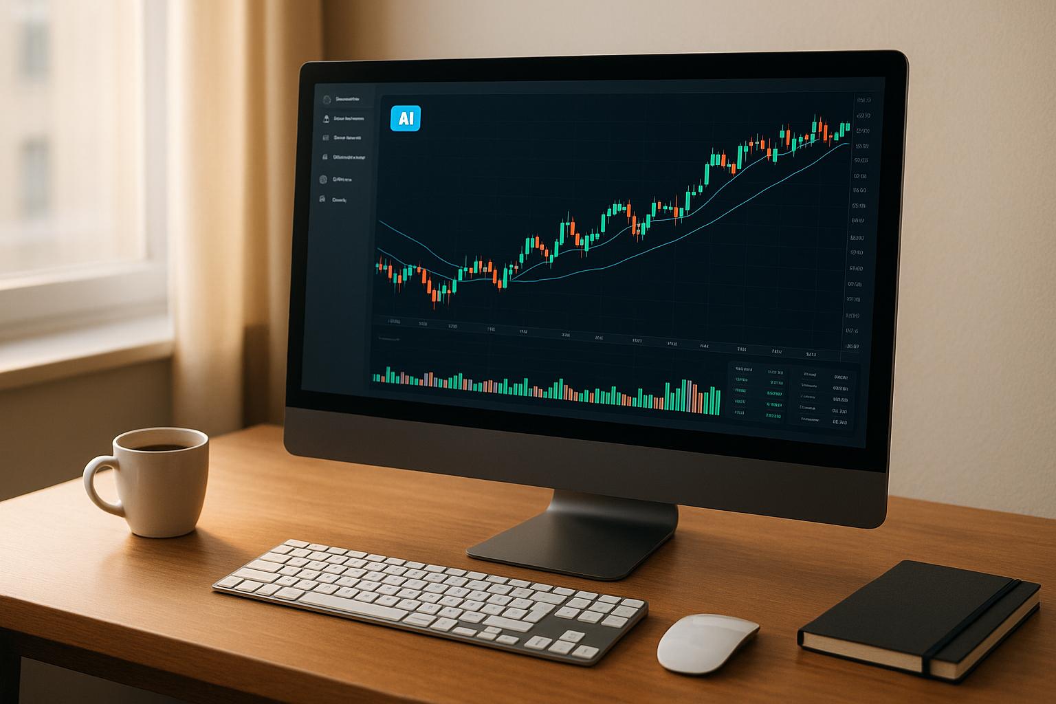
Interactive charting platforms are powerful tools designed to bring investment data to life. Unlike static charts, these platforms let you interact directly with the data - zooming into specific timeframes, filtering by criteria, hovering over data points for details, and switching between chart types with ease.
Think of them as a way to transform raw numbers into actionable insights. For instance, when analyzing a stock, you can shift from a broad yearly view to a detailed daily breakdown, overlay technical indicators, or compare multiple stocks side by side. The standout feature? You’re in control of how you view and analyze the data, rather than being confined to a preset format.
Platforms like TradingView and ProRealTime are popular examples, offering user-friendly interfaces with buttons, sliders, and tabs that let you customize your analysis in real time. This level of control opens up a range of possibilities for investors.
Benefits of Interactive Platforms
Interactive charting platforms provide a range of advantages, especially for those looking to dig deeper into market trends and make informed decisions.
One of the biggest perks is real-time data exploration. Unlike static charts that can become outdated within moments, interactive platforms keep you updated with live market data. This is especially useful during fast-moving trading sessions when every second counts.
Another advantage is their engaging nature. These platforms respond to your actions instantly, making data exploration feel more intuitive and encouraging you to dive deeper into market patterns.
They also shine in offering multi-perspective analysis. You can easily switch between chart types - like candlestick and line charts - or apply different technical indicators without needing separate charts. This flexibility allows you to tailor your analysis to your specific strategies.
Additionally, these platforms come with advanced analytical tools. Whether you’re overlaying indicators, drawing trendlines, or testing scenarios, you can do it all in real time. Many platforms even include social features, enabling you to share your charts, discuss strategies, and learn from a network of fellow investors.
Drawbacks of Interactive Platforms
While interactive platforms offer plenty of benefits, they’re not without their challenges.
For starters, they can be overwhelming for beginners. The sheer number of features, indicators, and customization options might make it hard to navigate initially.
The abundance of options also poses another issue: time management. It’s easy to get caught up tweaking charts instead of focusing on meaningful analysis.
Another limitation is performance on smaller devices. Limited screen space and lower processing power can make these platforms less effective on smartphones or older hardware.
Resource demands are another consideration. Slower internet connections or outdated devices may struggle to keep up with the data-intensive nature of these tools.
Finally, there’s the issue of cost. While basic versions of platforms like TradingView are free, advanced features often require a subscription. For example, the free plan might limit you to three indicators per chart, pushing serious users toward paid options.
And let’s not forget the potential for distraction. The very interactivity that makes these tools engaging can sometimes lead users to spend too much time adjusting settings rather than focusing on actual investment decisions.
When to Use Interactive Platforms
Interactive charting platforms excel in scenarios where real-time data and detailed analysis are crucial.
For day traders, the ability to track live price movements, switch between timeframes, and set alerts is invaluable for seizing opportunities in fast-moving markets.
If your strategy involves technical analysis, these platforms are a must. They allow you to layer multiple indicators, identify patterns, and draw essential support and resistance levels - all tools needed for in-depth evaluation.
They’re also useful for portfolio monitoring and risk management. With real-time updates, you can track performance, sector allocations, and risk metrics, making it easier to adjust your strategy as market conditions shift.
For education, interactive platforms are an excellent way for beginners to learn. Many offer paper trading environments where users can experiment with indicators and chart types without risking real money. This hands-on approach accelerates learning by showing immediate results.
Collaboration is another key strength. Investment teams or clubs can use these platforms to share charts, annotations, and insights, making group analysis more effective.
Finally, they simplify market research and sector analysis. You can quickly compare multiple securities, adjust timeframes, and filter data to uncover trends or opportunities.
For those ready to explore the best options, the Best Investing Tools Directory provides in-depth reviews and comparisons of various platforms to help you find the one that matches your needs.
Dynamic Design of Interactive Charts in Excel
sbb-itb-2e26d5a
Direct Comparison
To build on the strengths and weaknesses discussed earlier, let’s dive into a side-by-side comparison of static charts and interactive platforms. This breakdown focuses on key investment factors to help you understand the differences between these tools.
Research highlights an important distinction: "static visualizations excel at presenting clear, concise data stories, while interactive visualizations empower users to explore and make data-driven decisions". This difference influences everything from how quickly you can interpret information to how much control you have over the analysis process.
Feature Comparison Table
Here’s how static charts stack up against interactive platforms across critical features:
| Feature | Static Charts | Interactive Platforms |
|---|---|---|
| Real-time Updates | Requires manual updates; risks becoming outdated | Automatically updates with live data |
| Ease of Use | Simple and easy to grasp | Higher learning curve; requires familiarity with data visualization tools |
| Interactivity Level | Fixed, read-only views | Fully interactive: zoom, filter, and drill-down options |
| Beginner-Friendliness | Accessible for newcomers | Can feel overwhelming due to numerous features |
| Data Exploration | Offers a single, pre-defined view | Enables multiple perspectives and insights from one dataset |
| Load Time | Quick (1-2 seconds) | Slower (3-8 seconds due to complexity) |
| Device Compatibility | Works well on all devices and screen sizes | May struggle on smaller screens or older devices |
| Cost | Often free or inexpensive | Basic versions free; advanced features may require paid subscriptions |
| Accessibility | Minimal barriers for accessibility | Can pose challenges for users with specific needs |
| Information Retention | Standard retention rates | Improves recall by 23% compared to static visuals |
Performance metrics further highlight practical differences. For instance, interactive platforms typically need over 50 MB of storage and take longer to process, while static charts are lightweight, requiring only 2-10 MB and loading almost instantly. This disparity can influence decision-making, especially in fast-moving markets.
Static charts are ideal when clarity and simplicity are priorities, such as in quarterly reports, client presentations, or when quickly communicating a trend. On the other hand, interactive platforms are perfect for users who need to explore data in depth, run scenarios, or perform technical analysis for active trading strategies.
Ultimately, your choice depends on your investment style and experience level. Day traders and technical analysts often prefer the real-time capabilities and analytical depth of interactive platforms. Meanwhile, long-term investors might find static charts sufficient for tracking portfolio performance and making periodic adjustments. This comparison can help beginners align their goals with the right tool for their needs.
How to Choose as a Beginner
When deciding between static and interactive charts, beginners can simplify their choice by focusing on a few key factors. Your skill level, investment goals, and specific charting needs should guide your decision. As data visualization expert Ivan Kilin explains:
"To make an informed decision about whether to use static or interactive charts you need to know what is the suggested purpose of the chart. Should the reader grasp a complex idea? Or maybe dig deeper into the topic?"
What to Consider
Start by evaluating your technical expertise. If you’re just beginning to explore investing and feel daunted by overly complex tools, static charts are a great starting point. They highlight key information in a straightforward way, sparing you from navigating endless filters and features.
The complexity of your data is another key consideration. For instance, if your focus is a simple portfolio with index funds, static charts showing monthly or quarterly performance might suffice. On the other hand, if you’re analyzing multiple stocks, comparing sectors, or diving into intricate price patterns, interactive platforms provide the flexibility you’ll need.
Think about how often you need updates. Long-term investors, who typically check their portfolios monthly or quarterly, can rely on static charts that are updated periodically. But if you’re an active trader who needs to monitor market movements throughout the day, the real-time updates offered by interactive tools are essential.
Your investment timeline also plays a role. Short-term traders often rely on quick updates, trendlines, and volume indicators, while long-term investors benefit from more detailed chart patterns and technical indicators. The tools that work for a day trader aren’t necessarily the best fit for someone focused on long-term growth.
Finally, don’t ignore budget considerations. Static charts are often more affordable to produce, making them an attractive option for beginners who want to keep costs low while learning the basics.
These factors can help you identify the right tool for your specific trading style and goals.
Best Options for New Investors
For beginners, static charts are a practical choice. They’re easy to use, provide clear insights, and help you understand fundamental concepts without overwhelming you. As noted by the Women in Tech Network:
"Static charts offer clear, summarized presentations that are accessible and resource-efficient. Interactive is ideal for exploration and detail-oriented analysis, suitable for data-savvy audiences and requires more resources."
Once you’ve mastered the basics, you can transition to interactive platforms. This gradual approach builds confidence and prepares you for more advanced tools.
If you’re already familiar with technical analysis and actively trade, interactive platforms offer powerful features. They let you compare assets, analyze multiple timeframes, and dive into technical indicators - but they do come with a steeper learning curve.
A hybrid approach can also be effective. Many investors use static charts for routine portfolio tracking and switch to interactive tools for deeper analysis. This way, you get the best of both worlds without unnecessary complexity.
For more guidance, the Best Investing Tools Directory provides detailed reviews of charting tools and technical analysis platforms, helping you find the best match for your skill level and investment strategy.
Final Thoughts
Static charts are ideal for long-term investors who prefer straightforward portfolio tracking. They provide clarity and focus, making it easier to spot basic trends and patterns. On the other hand, interactive platforms shine when it comes to flexibility and detailed analysis, offering real-time data and technical indicators that active traders rely on. If you're just starting out, it's wise to begin with static charts to grasp the fundamentals. As you gain confidence, you can gradually explore interactive tools to deepen your analysis without feeling overwhelmed.
Seasoned investors often blend both approaches - static charts for regular monitoring and interactive ones for more in-depth evaluations. To avoid getting bogged down by too much information, focus on mastering one or two key indicators before branching out into more complex analyses. This methodical approach helps streamline your decision-making process and keeps your strategy on track.
FAQs
When should I switch from using static charts to interactive charting platforms?
When your analysis demands a deeper dive or more dynamic exploration, switching to interactive charting platforms can be a smart move. These platforms offer real-time updates, allow users to engage directly with the data, and make it easy to drill down into specifics. This makes them perfect for tackling complex analyses or delivering engaging presentations.
In contrast, static charts work well for straightforward overviews or quick summaries where interactivity isn’t needed. But if your projects call for in-depth exploration or require users to interact with the visuals, it’s probably time to consider adopting an interactive charting solution.
How can beginners start using interactive charting platforms without getting overwhelmed?
For those just starting out, the best way to get the hang of interactive charting platforms is by keeping things simple and progressing gradually. Choose platforms that are easy to navigate and come with straightforward features like chart setup, indicators, and customization tools. Instead of diving straight into complex functionalities, take the time to fully understand one feature at a time.
Using a trading simulator can be a great way to practice without the stress of real financial stakes. It allows you to experiment and gain confidence in a safe environment. As you become more comfortable, you can start exploring advanced tools and techniques to expand your expertise. A steady, step-by-step approach will help you avoid feeling overwhelmed while setting a solid groundwork for future success.
Can static charts and interactive platforms work together to improve investment analysis?
Static charts and interactive platforms work hand in hand to improve investment analysis. Static charts offer a straightforward overview, making it easy to highlight key insights at a glance. Meanwhile, interactive platforms let you dig deeper into the data, spot trends, and tailor the information to your preferences.
Using both together can be a game-changer. Start with static charts to get a broad understanding, then switch to interactive tools to examine specific details or patterns. This combination gives you a more comprehensive view, helping you make smarter, data-driven investment choices.